top of page
JESSICA LUKMAN INTERIOR

NESCAFE
POINT OF PURCHASE
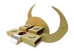
This point of purchase is design after the graphic of the new Nescafe mocha can drink, which accentuates its logo with circular elements. The two curves that backdrops this P.O.P is to highlight the items display, and to represent how this drink is suitable to be consumed at both day and night while fulfilling the caffeine need of Nescafe's customers. The position of the curves is set in this way to direct potential customer's eyes to the display that comes in two tier. The product placement is intently to be positioned in zigzag to give more dynamics in such a compact space.
 |  |
|---|---|
 |  |
 |
bottom of page